How a love of colour turned into our happiest mugs yet
Joylines began with a feeling rather than a product brief. We were seeing dopamine decor everywhere. Bold colour. Confident pattern. Interiors designed to lift your mood rather than politely blend in. That instantly chimed with us, because colour has always been at the heart of what we do.
It is also one of the main reasons we favour screen-printing. The vibrancy and depth of colour are hard to beat, and for a range built around stripes, colour had to do a lot of the heavy lifting.
From trend spotting to a clear direction
As with many of our ranges, the first step was a mood board. This gave us space to gather references, explore colour combinations, and see what kept drawing us in.
These were expressive stripes. Hand-drawn. Sometimes a little imperfect.
At this stage, the working name was simply Stripes. The aim was to create a striped range that could be mixed and matched across bold colourways, playful but considered, modern but not overly polished.
 Some early sketches
Alongside this, we were noticing a growing appetite for more organic, hand-thrown style shapes. Mugs that feel good in your hands, not just nice to look at on a shelf.
That made the decision easy. Joylines would sit on our Huggable mug. A modern shape that feels generous and comforting, designed to nestle into your hands with the warmth of your drink like a little hug. It felt like the perfect partner for something joyful and tactile.
Designing for curves, not cylinders
Of course, that shape came with its own challenges ...
The Huggable mug is beautifully curved, which meant the decal could not be treated like a flat rectangle. The artwork had to be subtly shaped so it would sit neatly once applied.
We also had to work out how much surface area we could realistically decorate by hand while still achieving the finish we wanted. There was plenty of trial and error here, measuring, adjusting and testing until the artwork sat just right.
Paint first. Perfection later.
With those parameters in place, our designer and all-round stripe enthusiast Charlotte got to work. She sketched a lot of stripey mugs. Straight lines, wiggly ones, thick and thin combinations, zig-zaggy moments, deliberately off-kilter marks.
 Charlotte's original paintings
These were then painted by hand onto A3 sheets in a wide range of hues and styles. Some were bold and graphic, others softer and more playful. Straight lines sat alongside wavy ones, and thick stripes were paired with finer details.
She also printed to-scale templates and painted directly onto what would become the decal surface area. This helped bridge the gap between concept and production, letting us see how each stripe would behave once wrapped around the mug.
Turning paint into screen-printed colour
Once the stripes began to take shape, it felt like the right moment to think about naming. The range became Joylines, a name that captured both the visual language and the feeling we wanted people to have when they picked one up.
 Some of our original ideas
Colourways were given food-inspired names to keep things playful and accessible: Marmalade. Cherry. Blueberry. Mint. Bubblegum.
The stripe patterns themselves were given more technical names, such as awning stripe, shadow stripe, wavy stripe and candy stripe. These helped us talk about the designs internally and externally, and we will be diving deeper into these in a separate blog.
With the naming locked in, Charlotte scanned the painted stripes at high resolution and carefully traced and refined them into workable vector artwork. The goal was to retain the character of the hand-painted marks while making them suitable for production.
We knew the colour families we wanted for launch, but we were not tied to exact shades at this point. Pantones were selected to reflect the original painted stripes while working cohesively as a set, then passed to our screen printer, Ceramicraft, who are specialists in full-colour screen printing.
Bringing Joylines to life
 Behind-the-scenes of our photoshoot
With samples approved and branding signed off, it was time for photography. This is where ranges really come into their own. Up until then, we had been working through sketches, painted stripes, colour matching and production decisions. Seeing everything styled and shot gave the range a new kind of clarity.
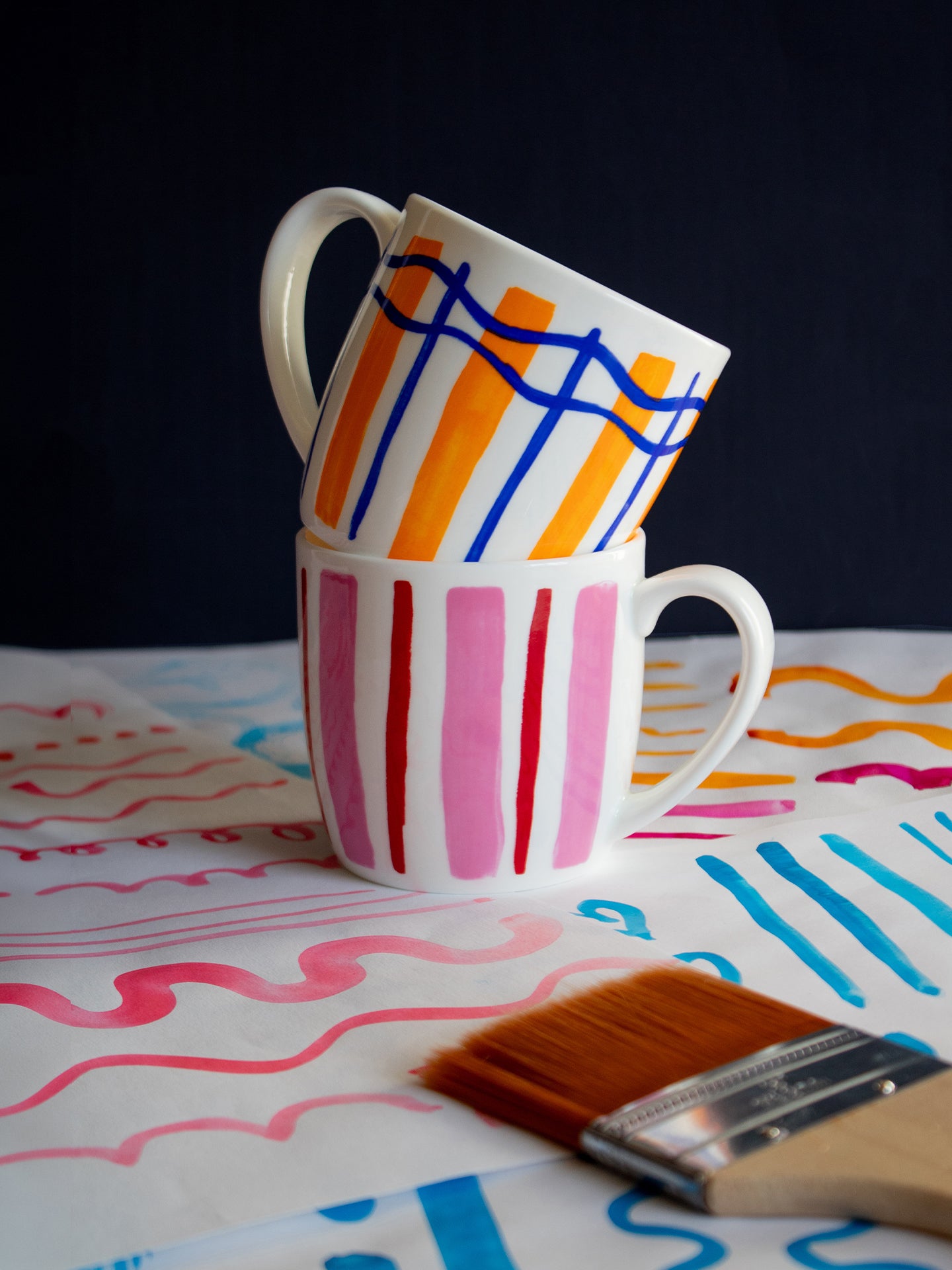
Because the designs are so bold, we knew the styling had to be handled carefully. Too much around them and the effect would be lost. Too little, and the images would not capture the warmth and personality we had built into the range. We focused on simple but cheerful setups that let the colour do the talking, while still giving the shots enough texture and life to feel inviting.
We also wanted to nod back to where the range began, bringing in Charlotte’s original painted stripes, paint brushes and groups of finished mugs. It helped connect the final photography back to those early creative decisions, and showed how the hand-painted starting point carried through to the finished range.
With everything signed off, Joylines was ready to take its place in our range. Prepared for trade shows and proudly featured in our 2026 catalogue, it brings together colour, comfort and craft in a way that feels unmistakably us.